[Vue] HTML5 Form Validation を利用するフォーム要素コンポーネント の続き。
脆弱なパスワードかどうか診断してその強さを表示するやつ、Wordpressにも備わってるあれをVueでやる。
サンプル
前記事のサンプルをForkして利用してるので、email.vue部分については前記事を見てください。
WordPressで使ってるやつはjQuery必須なので別のライブラリを使う。
で、ちょっと古いけどDropbox製のzxcvbnにしました。
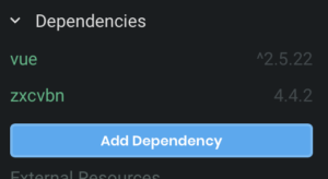
npmで追加。
コンポーネント作成
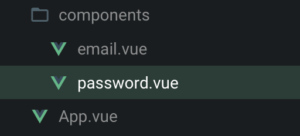
componentにpassword.vue作成。
email.vueの中身を一部流用したいので、mixinを作る。
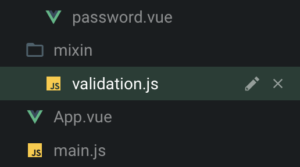
mixin/validation.js に、共通部分を移動させる。
// mixin/validation.js
export default {
  props: {
    value: {
      type: String,
      default: null
    },
    placeholder: {
      type: String,
      default: null
    }
  },
  data() {
    return {
      state: null,
      invalidFeedback: null
    };
  },
  computed: {
    isError() {
      return this.state === false;
    },
    isValid() {
      return this.state === true;
    },
    stateClass() {
      switch (this.state) {
        case false:
          return "is-danger";
        case true:
          return "is-success";
        default:
          return null;
      }
    }
  },
  watch: {
    value(val, oldVal) {
      if (val === null) {
        this.state = null;
        this.invalidFeedback = null;
      }
    }
  },
  methods: {
    onInput(e) {
      this.showFeedback(e);
      this.$emit("input", e.target.value);
    },
    showFeedback(e) {
      this.state = null;
      this.invalidFeedback = null;

      if (e.target.validity.valid) {
        this.state = true;
        return;
      }

      for (const key in e.target.validity) {
        if (e.target.validity[key]) {
          this.invalidFeedback = this.feedbackMessage[key];
          this.state = false;
        }
      }
    }
  }
};
pugになってるのはお察しください。
// components/email.vue
<template lang="pug">
.field
  label.label(for="input-email") {{label}}
  .control.has-icons-left.has-icons-right
    input#input-email.input(type="email", name="email", :class="stateClass", ref="input", :value="value", @input="onInput", @invalid="showFeedback", :placeholder="placeholder", required)
    span.icon.is-small.is-left
      i.fas.fa-envelope
    span.icon.is-small.is-right.has-text-success(v-if="isValid")
      i.fas.fa-check
    span.icon.is-small.is-right.has-text-danger(v-if="isError")
      i.fas.fa-exclamation-triangle
  p.help(v-if="state == null") This field is required.
  p.help.is-danger(v-if="isError") {{ invalidFeedback }}
</template>
<script>
import ValidationMixin from "@/mixin/validation";
export default {
  mixins: [ValidationMixin],
  props: {
    label: {
      type: String,
      default: "Email"
    }
  },
  data() {
    return {
      feedbackMessage: {
        valueMissing: "This field is required",
        typeMismatch: "This email is invalid"
      }
    };
  }
};
</script>
パスワードの方はtypeMismatchの代わりに文字数制限のminlength(tooShort)を追加。
もしpatternで半角英数字記号制限などするならpatternMismatchもいります。
<template lang="pug">
.field
  label.label(for="input-password") {{label}}
  .control.has-icons-left.has-icons-right
    input#input-password.input(
      type="password", name="password", :class="stateClass",
      ref="input", :value="value", minlength="6",
      @input="onInput", @invalid="showFeedback", :placeholder="placeholder",
      required)
    span.icon.is-small.is-left
      i.fas.fa-key
    span.icon.is-small.is-right.has-text-success(v-if="isValid")
      i.fas.fa-check
    span.icon.is-small.is-right.has-text-danger(v-if="isError")
      i.fas.fa-exclamation-triangle
  p.help(v-if="state == null") This field is required.
  p.help.is-danger(v-if="isError") {{ invalidFeedback }}
</template>
<script>
import ValidationMixin from "@/mixin/validation";
export default {
  mixins: [ValidationMixin],
  props: {
    label: {
      type: String,
      default: "Password"
    }
  },
  data() {
    return {
      feedbackMessage: {
        valueMissing: "This field is required",
        tooShort: "6 or more characters are required"
      }
    };
  }
};
</script>
zxcvbn追加
password.vueにzxcvbnを追加する。
mixinと同じメソッドをコンポーネントで設定すると、両方叩かれるのではなく上書きになる。
なので、onInputとshowFeedBackをpassword.vueでも設定して上書き、その中でzxcvbnを実行するメソッドcustomFeedBackを叩く。
  methods: {
    onInput(e) {
      this.customFeedBack(e);
      this.showFeedback(e);
      this.$emit("input", e.target.value);
    },
    showFeedBack(e) {
      this.customFeedBack(e);
      this.showFeedback(e);
    },
    customFeedBack(e) {
      const val = e.target.value;
      if (!val) {
        return;
      }
      const result = zxcvbn(val);

      console.log(result);
    }
  }
これで何かパスワードに入力するとコンソールにzxcvbnが返した内容が表示される。

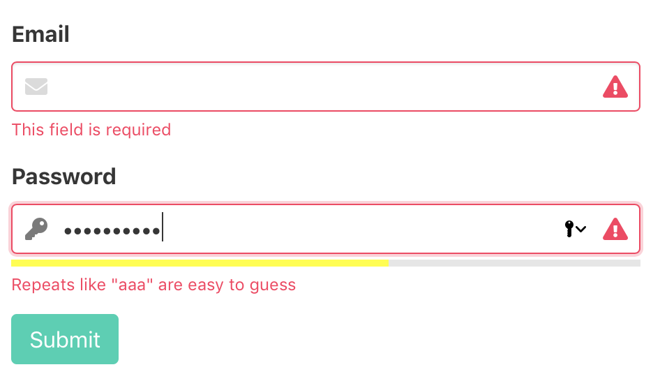
scoreが強度の指数で0が最低、4が最高。ゲージにはこの数値を使います。
feedbackにはヒントが入ってます。
強度ゲージ作成
dataにスコア用の変数 strengthScore 追加。
data() {
  return {
    strengthScore: null,
// ....
エラーの時スコアを0として利用したいので、 スコアを代入するとき1加算する。
customFeedBack(e) {
  const val = e.target.value;
  if (!val) {
    this.strengthScore = 0;
    return;
  }
  const result = zxcvbn(val);

  this.strengthScore = result.score + 1;
  console.log(result);
}
inputの下にメーター要素を追加する。
meter.strength-meter(ref="strength-meter", min="0", max="5", :value="strengthScore")
スタイルは長いのでcodesandboxのソース見てください。
webkitとmozでゲージのスタイルが別になるのだけ注意で。
これでパスワード入力するとゲージも連動するように。

強度フィードバックの表示
せっかくzxcvbnがフィードバックしてくれるので表示したいですね?
ついでに脆弱なパスワードだったらエラーにしよう。
setCustomValidityで何かしら文字列を設定すると、ValidityStateのCustomErrorがtrueになってエラー扱いされるので、
スコアが2以下あるいはfeedback.warningがあったらそれを表示とする。
warningが空な場合に備えるメッセージも入れておく。
//password.vue
if (result.score < 3 || result.feedback.warning.length) {
  this.$refs.input.setCustomValidity(result.feedback.warning || 'Password strength is insufficient');
} else {
  this.$refs.input.setCustomValidity("");
}
mixin/validation.js の方をカスタムメッセージに対応させる。
優先させるもの1つだけ表示するため、先にカスタムエラー以外のエラーチェックしてあれば表示、
なかったらカスタムエラーチェックしてあれば表示、みたく修正。
全部表示するならinvalidFeedbackを配列にしてpushする。
setCustomValidityで設定した文字列はvalidationMessageで受け取れる。
//validation.js
for (const key in e.target.validity) {
  if (e.target.validity[key] && key !== "customError") {
    this.invalidFeedback = this.feedbackMessage[key];
    this.state = false;
  }
}

// カスタムじゃないエラー優先表示
if (this.invalidFeedback.length) {
  return;
}

// カスタムエラー
if (e.target.validity.customError) {
  this.state = false;
  this.invalidFeedback = e.target.validationMessage;
}
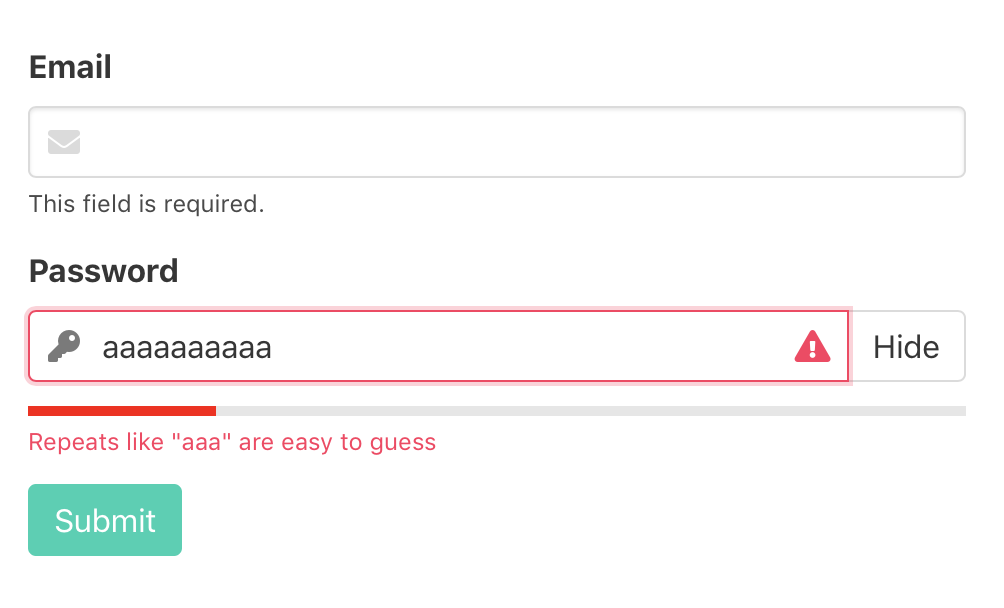
フィードバックも出るようになりました。
パスワードの表示・非表示切り替え
黒丸じゃフィードバックされても分からんので見える化しよう。
フラグ用の変数isShowPasswordを追加。
デフォルトはfalse(非表示)とする。
data() {
  return {
    isShowPassword: false,
// ...
}
テンプレートに切り替えボタンを追加。
// template
button.button(type="button", @click="isShowPassword = !isShowPassword") {{ isShowPassword ? 'Hide' : 'Show' }}
表示用のtype=”text”なinputを追加、v-showで表示を切り替える。
input#input-password.input(
  v-show="!isShowPassword"
  type="password", name="password", :class="stateClass",
  ref="input", :value="value", minlength="6",
  @input="onInput", @invalid="showFeedback", :placeholder="placeholder",
  required)
input#input-password-text.input(
  v-show="isShowPassword"
  type="text", :class="stateClass",
  ref="inputText", :value="value", minlength="6",
  @input="onInput", @invalid="showFeedback", :placeholder="placeholder",
)
表示用のinput[type="text"]にもsetCustomValidityを追加。
if (result.score < 3 || result.feedback.warning.length) {
  this.$refs.input.setCustomValidity(
    result.feedback.warning || "Password strength is insufficient"
  );
  this.$refs.inputText.setCustomValidity(
    result.feedback.warning || "Password strength is insufficient"
  );
} else {
  this.$refs.input.setCustomValidity("");
  this.$refs.inputText.setCustomValidity("");
}
ブラウザやプラグインのUIと喧嘩するので、表示切り替えボタンはinput要素に被さない方がいいと思う。
…ので、この後右のアイコンは決して左のアイコンの色が変わるように変更した。
フィードバックの日本語化
蛇足になるのでソースだけ置いておきます。
switch (result.feedback.warning) {
  case 'Use a few words, avoid common phrases':
    return 'いくつかの単語を組み合わせて、一般的なフレーズを避けてください';
  case 'No need for symbols, digits, or uppercase letters':
    return '記号、数字、または大文字は不要です';
  case 'Add another word or two. Uncommon words are better.':
    return '別の単語を追加してください。 一般的でない言葉が良いです';
  case 'Straight rows of keys are easy to guess':
    return '直線のキー列は推測しやすいです';
  case 'Short keyboard patterns are easy to guess':
    return '短いキーボードパターンは推測しやすいです';
  case 'Repeats like "aaa" are easy to guess':
    return '"aaa"のような繰り返しは推測しやすいです';
  case 'Repeats like "abcabcabc" are only slightly harder to guess than "abc"':
    return '"abcabcabc"のような繰り返しは推測しやすいです';
  case 'Sequences like abc or 6543 are easy to guess':
    return 'abcや6543のような文字の羅列は簡単に推測できます';
  case 'Recent years are easy to guess':
    return '近年は推測しやすいです';
  case 'Dates are often easy to guess':
    return '日付は比較的推測しやすいです';
  case 'This is a top-10 common password':
    return 'これはトップ10に入る一般的なパスワードです';
  case 'This is a top-100 common password':
    return 'これはトップ100に入る一般的なパスワードです';
  case 'This is a very common password':
    return 'これはとても一般的なパスワードです';
  case 'This is similar to a commonly used password':
    return 'これはよく使われるパスワードに似ています';
  case 'Names and surnames by themselves are easy to guess':
    return '名前と姓は簡単に推測できます';
  case 'Common names and surnames are easy to guess':
    return '一般名と姓は簡単に推測できます';
  default:
    return 'パスワードの強度が足りません';
}