ヘッダーとフッターを画面上下に position: fixed で固定表示する時に、iPhoneX系と第3世代iPad Proだと端末のUIが被ってしまう現象の回避策について。
Orientation – 画面の向き
画面の向きは古来から伝わる window.orientation の他、 Screen Orientation APIが利用できる。今の所APIのサポート状況はSafariとAndroid Browser以外といった感じなので、未来に備えて両方チェックするのが無難と思う。
  // Screen Orientation API
  // @see https://w3c.github.io/screen-orientation/#dom-screen-orientation
  if (screen.orientation) {
    result.orientation = screen.orientation.type.replace(
      /(-primary|-secondary)$/,
      ''
    );
    result.orientationType = screen.orientation.type.replace(
      /^(portrait-|landscape-)/,
      ''
    );
  } else if (window.orientation) {
    // Window.orientation
    // @see https://developer.mozilla.org/en-US/docs/Web/API/Window/orientation
    const w = window.innerWidth < window.innerHeight;
    const o = window.orientation % 180 === 0;

    result.orientation = w && o ? 'landscape' : 'portrait';
    result.angle = window.orientation;

    // set of orientationType
    switch (window.orientation) {
      case 180: // landscape
        result.orientationType = 'secondary';
        break;
      case -90: // iOS portrait
      case 270: // Android portrait
        result.orientationType = 'secondary';
        result.angle = -90;
        break;
      default:
        result.orientationType = 'primary';
    }
  }
window.orientationは portrait で逆向きの時の値がiOSとAndroidで異なっていて、iOSでは-90、Androidでは270になる。
Screen Orientation API のtypeとWindow.orientation の値は次の通り。
| orientation | orientationType |
|---|---|
| 0 | landscape-primary |
| 180 | landscape-secondary |
| 90 | portrait-primary |
| -90(270) | portrait-secondary |
SafeArea Insetの検出
端末からボタンが消え去ったiPhoneでは、画面にノッチとホームバーが被さってくるので対応に四苦八苦させられてきたけれども、とうとう iPad も 第3世代のProからボタンがなくなってホームバーになってしまった。
スタイルシートではSafeAreaの余白が必要な場合に safe-area-inset-left などの環境変数が利用できる。
env(safe-area-inset-left)
これと同じ値をJavaScriptで欲しいとなると面倒臭い。
APIで用意されていないので、CSSでセットされる値を検証しなければならない。
// サポートチェック
if (CSS.supports('padding-left: env(safe-area-inset-left)')) {
    // スタイルを当てる
    const div = document.createElement('div');
    div.style.paddingBottom = 'env(safe-area-inset-bottom)';

    // DOM追加
    div.style.display = 'none';
    document.body.appendChild(div);

    // スタイル取得
    const style = window.getComputedStyle(div);
    const bottom = parseInt(style.paddingBottom, 10);

    // ステータスバーの高さ含まれた場合を考慮
    const statusBarH = 20;

    if (bottom > 20) {
       result.hasSafeArea = true;
    }

   document.body.removeChild(div);
}
見やすくするためにbottomだけに削ったが、端末の向きを「landscape-secondary」にした時も画面内は「landscape-primary」で固定されるので、実質top以外をチェックすれば対応しているかどうかは判別できそうである。
resize イベントハンドラでこの検証を実行すれば、画面スクロール後のサイズ変更も検知できる。
iOS13系だとステータスバーの高さがinsetに含まれるということはなかったので、0で比較するか20で比較するかは、iOSバージョンのサポート範囲によって決めればいいと思う。
CSSの場合
<meta
      name="viewport"
      content="width=device-width, initial-scale=1, viewport-fit=cover"
    />
meta[name="viewport"] に viewport-fit="cover" を追加する。
これがないとSafeAreaの余白が消えない。
@supportsでチェックして、対応していればpaddingやmarginに消した分の余白を追加するように指定する。
@supports (bottom: env(safe-area-inset-bottom)) {
	#bar {
		padding-bottom: env(safe-area-inset-bottom);
	}
	.content {
		padding-top: env(safe-area-inset-top);
		padding-left: env(safe-area-inset-left);
		padding-right: env(safe-area-inset-right);
		padding-bottom: env(safe-area-inset-bottom);
	}
}
iOS11.2以下をサポートするならconstant()をフォローしなければならないが、もう存在しないと言っても過言ではないのでenvだけでいいと思う。
Safariはこの方法で全画面にできるが、iOS版Chromeは余白が消えなかった。
サンプルコードとデモ
AndroidのSafeArea
Androidにもノッチ付きボタンなし端末が存在するものの、iOSのviewport-fit="cover"やSafeArea環境変数のようなものは無いので、特別にやっておくことはなさそうである。
Android端末のノッチを検出するプラグインを作っている人がいるが、完全対応とまではいかないようだ。
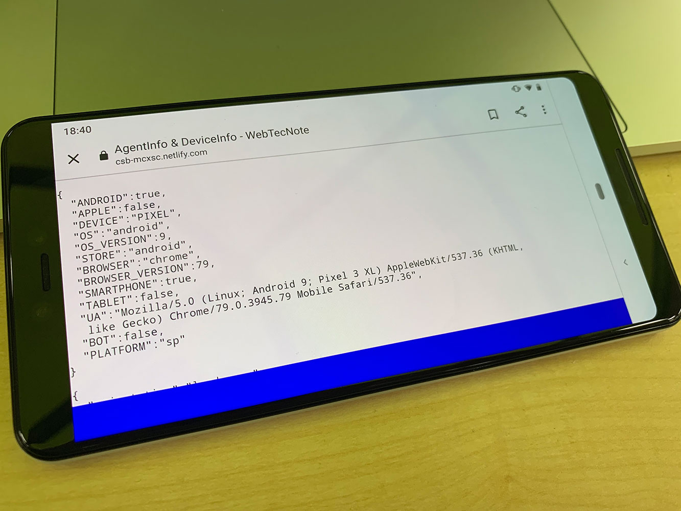
Pixel 3 XL
Android バージョン9
portraitではブラウザの外枠が隙間を埋める格好になるのでノッチ部分がかぶさって見えなくなるということはなかった。